It’s nearly impossible to be online and remain unaware of the fact that Taylor Swift is releasing yet another album. But the topic of conversation this time around isn’t about the music—it’s the album cover. It’s no secret that Taylor Swift is a money-making machine, so witnessing a plethora of brands race to match their iconography with The Life of a Showgirl was far from surprising. I’ll admit I have never been a fan of Swift, and so far TS12 is no exception, but I figured I’d consult a design expert on the matter—one who can articulate just why this album cover might not resonate with most people (especially those of us who aren’t Swifties).
Alex Crandall is our lead designer here at Shelf, and in between his incredible work on the upcoming [redacted], Crandall offered up some thoughts on Swift’s debut visuals for The Life of A Showgirl…

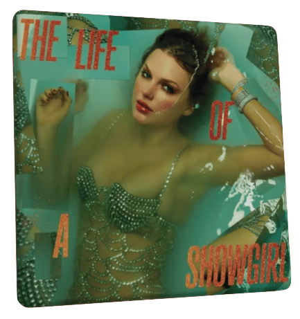
From a straight-up design and aesthetic perspective, I think the cover is pretty boring to look at. It forces the person who's looking at it to go all over the picture because of the way the text is structured. It's not really a grid, it's not really organized in any logical standpoint, and you typically wouldn't think to give such big separation to this many small words. She's going for this shattered mirror aesthetic because of the way these pieces are overlapping—doubling up on parts of her arm, her hand, and her body. It's all just very basic. For me, when I look at this, it's a weird photo that is very poorly edited in my opinion. The way that she's choosing to frame the portion of her chin to her hairline in coming up above the water is visually very unappealing.
The type is some of the worst I've ever seen—it's thin and compressed and it's italicized for no reason, and the shades and tints of orange or glitter that they're using throughout are not balancing correctly with the areas of the background that they're in. They're using the dark orange on some of the darker shades, and the lighter shade of orange is only on the “A” and that's the first thing that your eye is drawn to because it's visually the brightest thing on the page. The type, I think just lacks the ability to express anything of interest. I get the sense from The Life of a Showgirl, that this was written on tour, and she's referencing Ophelia. This should be very deeply evocative and have a lot of power in it, and this type is so uninteresting. It has no personality. Boring type is bad, but boring type that has nothing to do with the storytelling of your design is worse.
If Swift wants to reference Ophelia, being this performer that is still manipulated by the people around her, and this idea of manipulation becoming maddening (and clearly there's something about that with regaining her masters and having the most successful tour of all time) hopefully the album is actually about how she has overcome the manipulation. We already have 11 albums out about the other thing.
From a Taylor Swift lens, the most exciting aspect of this album is the fact that she's re-partnering with Max Martin and Shellback, who did Red, 1989 and Reputation, which are I think some really well-celebrated albums for her. And I think there's a little bit of visual reference to both Reputation and Red (because she used the same photographers, and this typeface is very similar to Red), but I don't really understand what we're looking at here. It doesn't really resonate “showgirl” at all. It's very surface-level, and it feels like the first idea.
The last thing, this is “go on girl, give us nothing” when you compare it to her alternates. I think Taylor Swift is horrible in her overconsumption of creating variant covers because one, you're just manipulating a bunch of 15 year olds into buying four versions of the same album because they have different pretty covers, and two, your alternates are better. This is not the best option she had on the table, but I guess that's the victim of choice. Every other variant that has come out is more visually interesting.
Overall, this over-reliance on variants from Taylor Swift and a lot of other artists is a point of capitalism that is such bullshit, rude, and manipulative to your fans because you're an artist and your work should speak for itself. The goal of album artwork is to find a single image to evoke an entire package, and this reliance on variant covers and alternate color ways and variant color pressings just means that you don't actually have a cohesive vision and message. Because if you can't put it all into a single image, then your visual artistry is actually not that deep, and Swift is a person who’s celebrated for the depth of her storytelling in word and melody.
Curious about what else Alex is into? Get real-time updates at shelf.im/awcrandall


